Components
Browse components, examples and API references.
General
Navigation
Data display
Data entry
Input
Enter a single line of text.
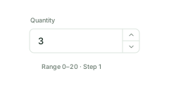
InputNumber
Enter quantities, prices and numbers.
Textarea
Enter multiple lines of text.
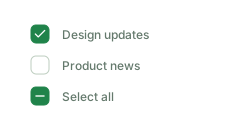
Checkbox
Select one or more options.
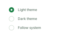
Radio
Choose one option from a group.
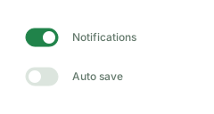
Switch
Turn a setting on or off.
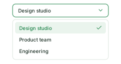
Select
Choose an option from a list.
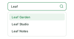
AutoComplete
Complete input with suggestions.
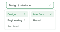
Cascader
Choose a hierarchical value.
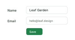
Form
Organize fields and validation.
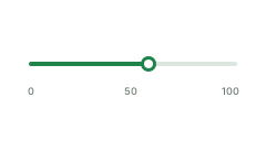
Slider
Choose a number or range by sliding.
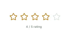
Rate
Select or display a rating.
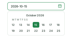
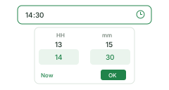
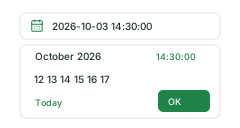
Date and time
Feedback
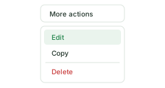
Dropdown
Group actions in a menu.
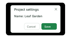
Modal
View or edit inside a dialog.
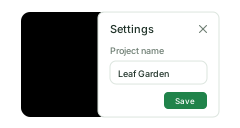
Drawer
Open content from a page edge.
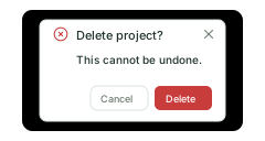
Confirm
Confirm important actions.
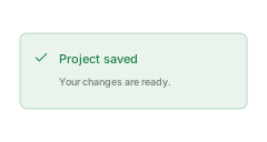
Alert
Display information that needs attention.
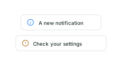
Message
Show brief operation feedback.
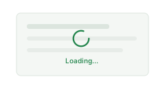
Loading
Indicate loading content.
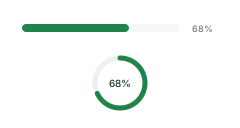
Progress
Display task completion.
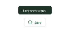
Tooltip
Add brief explanations.

Skeleton
Show a content placeholder while loading.
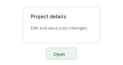
Popover
Show details or actions next to an element.